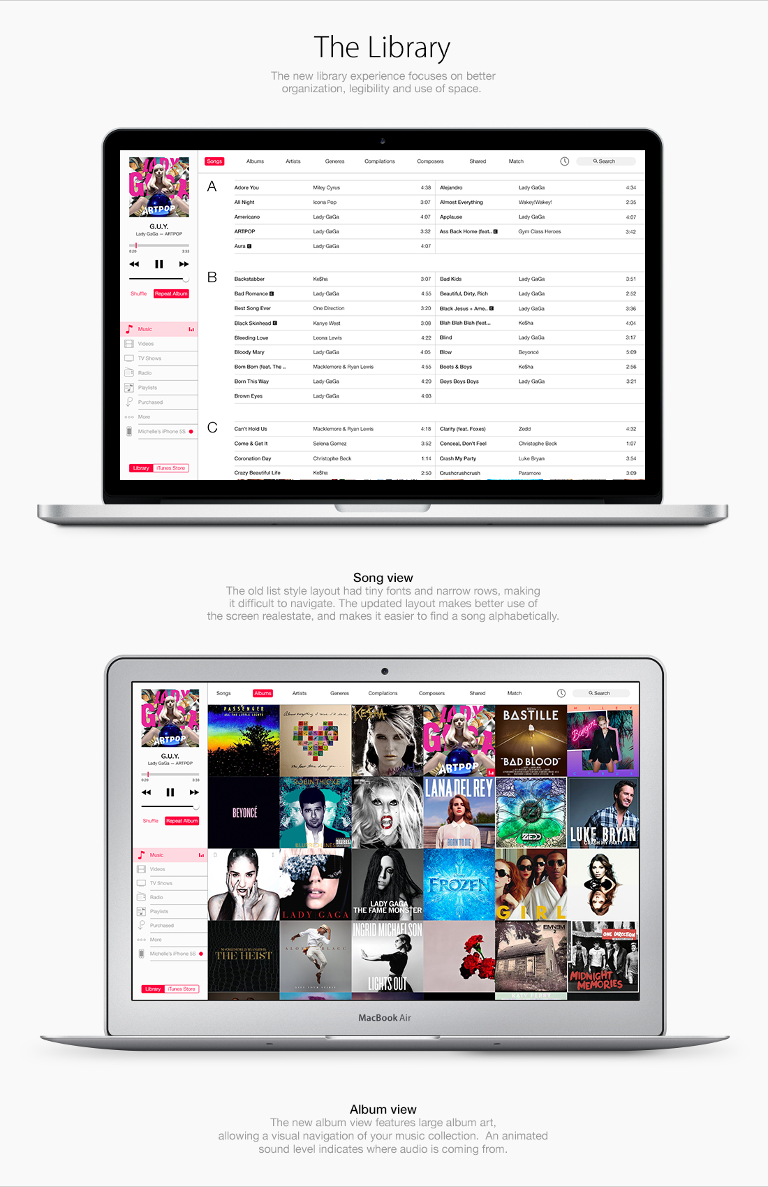
I'm sorry, but these are just some pretty pictures with zero usability. You've let down all of the key elements, making them so small, that they disappear from view. The diversity of text and icon styles plus quite random alignment messes up the structure and clutters the space. And there is no air in there. Margins and gutters were never evil, why do you avoid them so much? This avoidance damaged the alphabetical song view (second column isn't recognized as a continuation of the list), it also damaged the album view, now it blends into itself making an appearance of a unicorn-puke.
To sum it up, making a great research on the topic, you've failed to accomplish the problems stated in the beginning of this article. The remastered iTunes is cluttered, incomprehent and overwhelming.
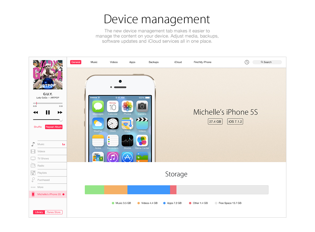
I have to agree with HAMOP. The problem with iTunes isn't the visuals, it's the usability. For example, I have hundreds of albums for which I either don't have artwork, don't recognize the artwork, or have seen a million times and don't care about the artwork. I need to see albums organized by name, not images. Bigger pictures doesn't improve the usability. The same could be said for the other "improvements" : the problem with device management is that there is no efficient way for me to organize the 100+ apps I have. Dragging them one-by-one across screens is a pain in the ass. I need to be able to select large numbers of apps and group them quickly. This is better done in a menu-based format than the current iTunes layout.
I can understand your point of view with some aspects you've mentioned however your insight is rather over zealous, I think this is a great concept and direction for iTunes. I agree that the current version is out dated and lacks any user friendly aspects, this design is a modern inspiration for their UI. My only revision would be increasing the visibility of 'New Songs, New Releases, Trending, Our Favourites', the font size and colour makes these difficult to see in comparison to the album covers.
While you have a few points, it's like throwing the baby out with the bathwater.
Overall, this would be a massive improvement over the current iTunes interface, unquestionably.
If he took the two column alphabetical listing and separated them with a gutter, that would easily solve that issue of column recognition. Far better grouping than the endless list that all blurs together, in my opinion.
As for the albums, I have to agree. All those different blocks just shoved right up against each other is too much. I think if it allowed you a slider to size them, with them getting some more space between them as they got smaller, that would help. Maybe not a continuous slider, just a small-medium-large one.
I think this work is a big step in the right direction. The layouts use proximity and chunking of similar elements to create zones for navigation and content in a way that the current version of iTunes does not employ. Nice job.
Itemize your concerns and speak directly to the areas where you see issues. "Clutters the space", "the key elements", "pretty pictures with zero usability", "quite random alignment" are vague and kind of bizarre takes on this. Wilson brings up a good point that gets to a usability problem for him very quickly. After all, it's his music and this app is supposed to make it easier for him to organize, which the designer will have to reckon with if we wants to develop further. With your complaints, while defining someone's design exploration as a "failure", you haven't furthered the conversation or exploration at all. You took a big poop on it, but you could of done, and almost did, in expressing your distaste for something specific like the second column in the alphabetic song view – is offer a suggestion or a solution. Instead on another odd note, you accused the designer of avoiding margins and gutters, two things in use in the comp. You might be an amazing designer, and have more wisdom in the application of these elements. Why not offer some suggestions? You wrote the paragraph to trash the concept. Why not offer up a little design wisdom or another approach?
Bottom line, your high-horse condemnation of the concept without really adding to the conversation is just another reason people won't try to innovate like this, won't ask for criticism, and will ultimately begin to not respect your opinion. Try to be constructive man.
Totally with Jake on this one. Not only Hamop's comment fails to provide a constructive criticism, it is also very harsh. You may be a great designer and maybe you could do a better job. But saying this concept has "zero usability" and "appearance of a unicorn-puke" is just very very mean. I've seen a lot of criticism on Dribbble or Behance, but to be honest this is by far the rudest one. In fact I'm finding it hard to believe there are people like you in 2014. The man just try to make a little concept, you don't like it, fine, post a constructive comment or come with a better version yourself. But don't start saying nasty stuff just because you hate his work. I don't even care what you have to say if you say it in such a horrible manner.
When you started talking about nomenclature I stopped caring. Yeah, good design and all but respect developers naming system. It's not 10.1 its 10.10 thats the way it works, we're not treating this as a mathematical system. 10.1 is 9 versions behind 10.10, 10.10 is not 10.1 Who cares if you don't like the way it looks, its not for you. It's for software versioning so everyone knows what **version** it is. Why you bring this up seems really confusing and unrelated to what you're trying to present us anyways. Cut out stuff like this, that you don't have an understanding of, nor wish to and instead focus on what you want us to see - which is your itunes concept.
The symbols humans use for written language have specific meaning. Otherwise, there'd be no point in ever writing anything down. You can't write the word "David," then simply insist that it spells the word "John," just because you (or a small group of people) have decided that it does.
Similarly, the symbols "10.10" already communicate — quite clearly — an arabic, numerical concept. Every symbol in that grouping has a distinct, *meaning*, and one cannot just arbitrarily decide that it means something else. People who have logical minds understand this effortlessly. People who don't have logical minds will not understand why this is a problem (or will pretend that it isn't one).
Whether you like it (or admit it) or not, the grouping "10.10" is NOT "ten point ten." It is mathematically identical to the grouping "10.1" and is equivalent to "ten point one." The final zero means absolutely nothing (and — ironically — the very computer on which you're reading these comments exists and functions *because* zero means zero and because one means one). You cannot simply *say* that the trailing zero is meaningless — that is, not if you wish to be thought of as intelligent.
If Apple chooses to "buck the system" and stick with "ten point ten," sure, it'll catch on, and we'll all be forced to say it. But in a society where most people are already scientifically and mathematically challenged (perhaps you're one of them), it would be unfortunate to "teach" millions of people that "10.10" is any different from "10.1," because it simply is not. Even if Apple calls it "ten point ten," that doesn't make it correct. The fact that it's for "software versioning" does NOT invalidate the rules of numbering and nomenclature. Until now, all "software versioning" nomenclature has always made perfect, mathematical sense. They were identical. Now, suddenly, the rules are being broken — and you're suddenly claiming that "software versioning" now suddenly operates by different rules. Um, no. That's preposterous. Ignorance does not excuse poor choices.
10.10 = 10.1. You can *say* it doesn't, but that won't make you — or Apple — correct. Ever.
Great work on the redesign here. I like it in most part.
-- now the obligatory rant by Computing engineer about SOFTWARE VERSION !
Normal people should stop to read me. It's only for people with obsessive concerns.
SOFTWARE VERSION IS NOT A MATHEMATICAL DECIMAL NUMBER AND NEVER WAS !
10 dot 10 is not a decimal number. it's a version string as used since decades by engineers
Like Software version 5 release 12 patch 25 release candidate 2 -> v5.12.25rc2
yes it is.
it's just a "version number" to follow progress on software.
10.10 or 13D65 (build number of os x 10.9.3) will stay like that, because it's useful. nothing MORE.
for commercial reason, Apple could write OS X 10 on the website and logo, or 10-10 or 10#10 or 10~10 or whatever creative people will choose.
and if one day, with a whole change in the kernel and frameworks, Apple decide it's no more enough to call it Os X, they could call it :
OS 11 (version 11.0) or New Os 1 (1.0 with Darwin 15.6.0 xnu-7822.125.18~1)
(for example Os X 10.9.3 is Darwin 13.2.0, xnu-2422.100.13~1/RELEASE_X86_64)
you read well, xnu, the main component of what is Os X and iOS, is numbered ad 2422 DOT 100 DOT 13 tilde 1 :) it's not a decimal number.
Apple is not innovative here, it's not new.
The latest Linux Kernel is numbered 3.15-rc7 The latest Safari is 7.0.4 (9537.76.4)
SEVEN DOT ZERO DOT FOUR (double decimated number ? :) )
"software versioning" operates by different rules, not suddenly, but for decades (even with letters sometimes, like the classic X11R6 11th Version of the X protocol, sixth release) because they are NOT decimal numbers.
It's NOT about mathematics. it's NOT about you. it's only an engineering tool to follow progress in software.
"Until now, all "software versioning" nomenclature has always made perfect, mathematical sense"
no.
"Now, suddenly, the rules are being broken"
there were never been rules to follow. It's just whatever fantasy of the developers.
Adobe Photoshop CC is also numbered 14.2.1 (for now).
And so on and so on.
I know because there is a dot, so people assumes it's mathematical number. a - would have been nicer, but it is the way the whole computing industry (myself included) are working.
You know even weirder ? prepare your mind:
in France, we use , to separate decimal. An musical album costs for example 9,99 euros BUT we still use . for software version.
Mark, you're wrong and you pointed that out basically with your first sentence. 'Symbols humans use for written language have specific meaning', version numbering is a specific tool written by humans with a specific meaning. It's not some silly little marketing catch by Apple, its not some new trend - its a positioned and required engineering tool so that everyone is on the same page as to what version of software is what. Also you really seem to contradict yourself, I can see the angle you're coming from mathematically, which is strange since because you're touting phrases to pride your intelligence you seem to have little regard for engineering or technicalities. 'Until now, all "software versioning" nomenclature has always made perfect, mathematical sense.' - you are aware that Apple wasn't the first company to release more than 9 versions of the same software. Windows 8 internally is build v6.3.9600 - thats quite the large number of digits after it.
Lets do some nice little exercises shall we:
10.10 is the tenth version of the tenth operating system, 10.1 is the first version of the tenth operating system. Got it ok, lets move on. Lets go announce the next great OS.
10.11 is the eleventh version of the tenth operating system. Now if 10.10 was read as 10.1 the...wait... its suddenly the first version of the tenth operating system, and for some reason we've now jumped all the way to the eleventh version. what happened to 2,3,4,5,6,7,8,9,10?
Now I know this is an Apple 'related' article but just try to find a company, or engineer, or program that follows your philosophy on this. It doesn't make sense. No one does it. Because its SOFTWARE VERSIONING 101, not mathematics.
People who don't have logical minds will not understand why this is a problem (or will pretend that it isn't one). Really....really?
10.10 = 10.1. You can *say* it doesn't, but that won't make you — or Apple — correct. Ever.
10.10 != 10.1 I said it, every software developer stands with me on this and I, and every company (including Apple) are correct. We always have been.
I definitely appreciate the effort and original idea but I feel with so much research you've come up with a solution that's more unusable than the previous versions of iTunes. Big imagery is pretty sure but it's not all about aesthetic qualities. The product could look awful but still be super functional and THAT is what wins over users. Just my 2 cents. Great work all in all!
The comments here are quite critical about your work, some of which I can respect more than others. But imagining this as an everyday experience, I think it would be quite a usable app, especially in comparison to previous versions of iTunes and even other music apps like the new Spotify.
Just a little nit-picky thing though - the graphic displaying the Album mode has the 'Song' button highlighted. Otherwise, this is amazing work.
Since you're so quick to criticize previous designs of iTunes in completely meaningless and esoteric ways, I'll give you an equally breathtaking bit of feedback: this is terrible. You also have no respect for common developer conventions, so it's clear to me you're purely a designer at heart with no idea of how to develop anything you put to pixels. Typical dribbble/behance crap du jour.
Andrew, I understand your concerns but your bitter comment was not helpful to the designer or anyone else. Perhaps try being more constructive in your criticism next time if you are miffed about the designer's apparent lack of development. Therefore they are more informed and can design stronger concepts in the future. Or you could just hold your tongue and not turn the feed into a diva bitching contest.
Looks great. And you've laid it out nicely. With regard to usability and visual design, on the surface, you've got some cool ideas. Obviously its more work to really know what will or wont work. But this is conceptual and should probably be discussed as such. It'd be neat to see some of this put to the test. Good App to tackle too. It's ripe for transformation. Currently iTunes has plenty of issues, and I am sure the team that works on it would agree, AND it's not an easy problem to solve for.
I applaud your effort and willingness to workout a concept of your own, and critique away! ...It's good practice.
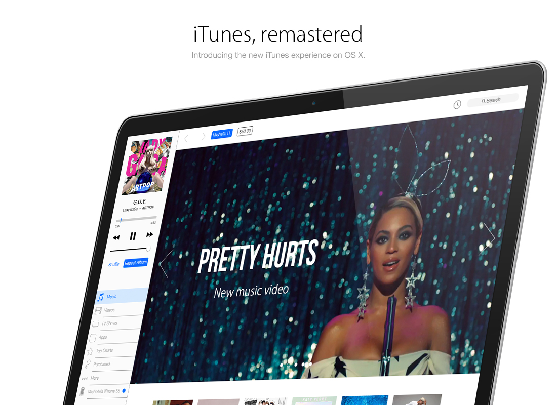
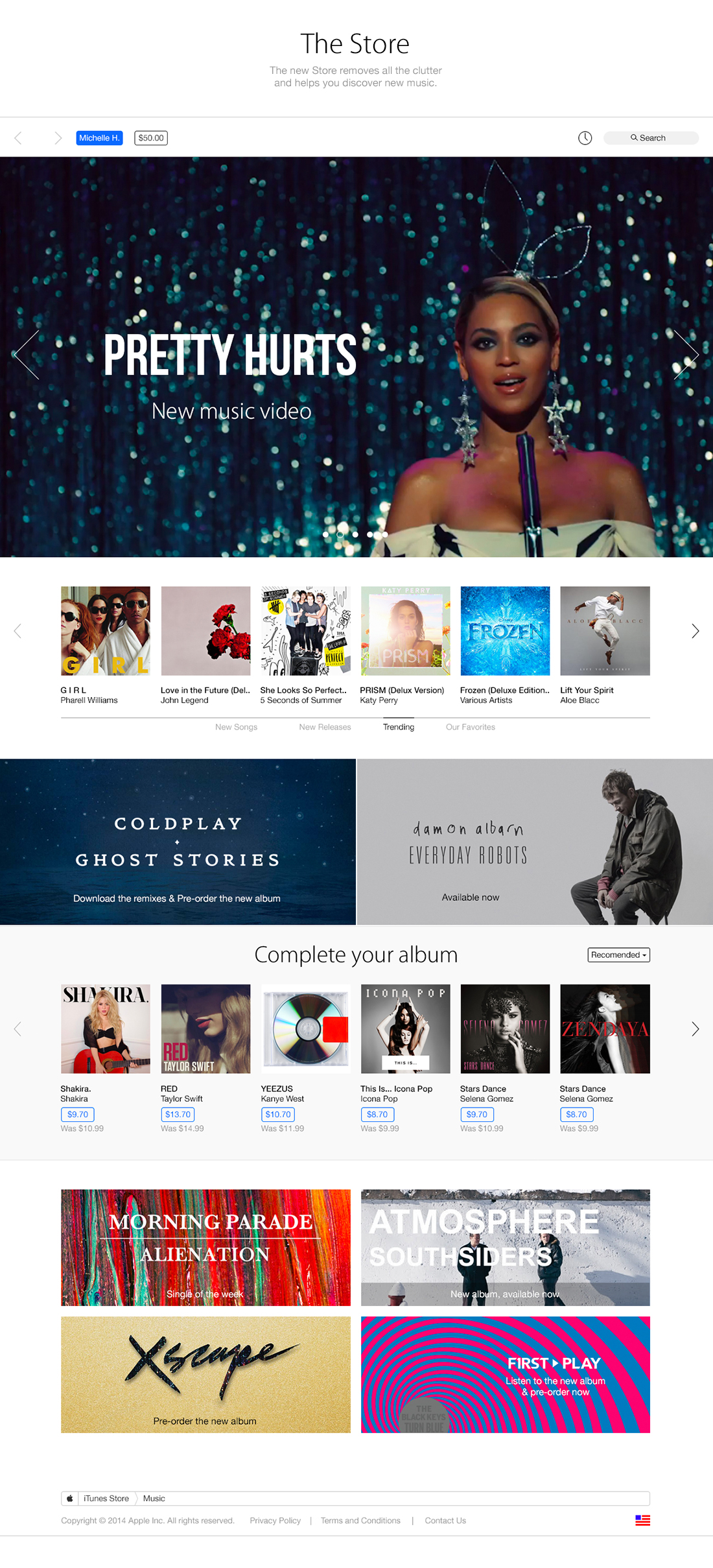
This is impressive, I must say! It's quite surprising you used mostly images for the website. Just a note; in the image right beneath the "iTunes, remastered", the Beyonce image does not look tilted to the right angle. A little more z-axis tilting would have been perfect. Aside that, you've done a great job! iTunes definitely needs a redesign.
Looks pretty, but its not very polished, as in you didn't account for many things that would come up as soon as any developer looked at the mockups. There is no affordance or icon or toggle to switch from song view to album view, and other things like this. realestate is two words, real estate.
A music player is not about displaying music in a beautiful way, it's about letting you find that one song as fast as possible, so you can enjoy it right away.
Why this design won't work for me: I've got more than 10,000 songs - 500 alone starting with an A. Displaying them in 2 rows makes reading while scrolling very hard. To find the right song as quickly as possible, I need to see more information about a song at once: My rating, the genres I defined, when I last played it - these are clues that help me find a song: e.g. "That cool (aka 5 star rating) new song by some band starting with an E that I heard recently". iTunes as it is allows me to define my own way of browsing (smart playtlists, I've got nearly 100 of them) that I use instead of Genre, Album, etc, because they allow me to quickly access "60ies Rock", "90ies Hip Hop", "Acoustic Soundtrack" etc.
You are right, iTunes is ugly. But it's useful! The above concept though is just pretty, and not useful. (And I don't and wouldn't watch the iTunes app while listening to a song.)
I still have not updated to iTunes 11 because of the new album view which replaces cover flow view. Before iTunes, we did have to buy whole albums even if we only liked one song from them, but now we can buy single songs. Not everyone buys full albums from iTunes nowadays. A lot of peole, like me, buy single songs from independent artists on Soundcloud, Bandcamp... for example. And some of these songs can from albums, but some are not part of an album at all. Some of those songs dont even have any album art. So for people like us, the album view is useless.
Also, a lot of people like to sort their songs by date added, having the newest songs at the top instead of having them all sorted alphabetically. I dont see how you could sort by date in this concept.
Making iTunes simply be 'prettier' doesnt make it better, it has to also still have features and options that can be useful to everyone.
Where are my playlists? Where's my song meta data with play counts, genres, date played, etc? The spreadsheet-y style song view may not be attractive, but it works. I don't want giant pretty pictures. I don't care about album covers and I rarely use iTunes to watch music videos. I want to see my music data. Your designs are a terrible example of form over function. Edward Tuft would have a field day with these.
When scrolling through huge lists, a person generally wants to keep their eye in a single position and move the text under it: By making the list's beginning break mid-way and having two "pages", you've broken that rule, meaning you're forcing the person to stop frequently.
To clarify? People do still scroll. They don't automatically know what they want: they skim, see something that catches their eye, scroll back and open.
Also moving the position of the bar along the top and screwing up the bar on the left? I mean, really? I spend most of my time inside playlists.
tl;dr: Form over function. Your work is terrible. What were you thinking??
Love how many of you get angry as if this guy were shoving this design up your ass against your will. This is a design project, he analyzed some of the issues iTunes haven't. This is not the next iTunes update (yet?). People get offended so easily nowadays, someone actually said he was disrespectful to the iTunes developers because of a single digit game where he thinks aesthetically works fine and matches the name of the system... really? Pussy much.
This is a concept. It is not perfect, any concept is. As someone said, scrolling though 2 columns to search a song between +10,000 other songs wouldn't be easy (then again, there's a search bar). Some of you don't even give a single fuck: "if it works fine, why make improvements? I'm already used to what it is and changes would bother me way to much to learn how to use. At. former Winamp users."
Let's just make constructive criticism, explicit criticism, share opinions, not just being a jerk whose comment is "This is terrible". This is based in what iTunes is, how it works, its flaws, its possible improvements, image UPDATING, and I know most of you wouldn't give a shit about design but this isn't just a "pretty pic". Developers should open their mind to something else beside programing, there must be something visually amusing, otherwise your work will pass unnoticed.
Your comment is the perfect example why iTunes (the real one, not this concept) is a cluttered mess right now. Designers blaming programmers and programmers blaming designers.
In my own opinion iTunes first of all needs an overhaul in stability, usability and speed. And I'm talking about the whole iTunes experience here, including iDevice synching, iTunes match and all that stuff that has been clutched into our former favourite media suite over the years. When all of these neat ideas work the way like they should, then we can talk about new functions and maybe about a new design.
Tackling user experience is always difficult. Simple is hard. How do you put more information on screen without cluttering it? Sometimes the most prettiest design is the worst functionally. You've done a wonderful job of positioning all those pixels in an eye-catching way based on iOS 7. Great job for that.
You need to do more research into user behaviours and create use-cases. What about someone who wants to find something quick because they're at a crowded party and they're kinda drunk. What about grandma who just wants to find a specific Frank Sinatra song her son bought her. What about a mother holding her baby whilst desperately trying to find that one song she knows would send her son to sleep at 3AM?
People and situations should be what you design for. That is how you solve UX.
Exactly what I was thinking. Rather than make this a huge reply, I've put my thoughts below. I'd add that the other thing that has to be done is testing testing testing.
I would love this as a Songbird skin, to be honest. Apple may never go this route but if you truly wanted to make it a reality, I am sure many people would love it.
Hi! I have some grammar comments (no, not nazi-like grammar comments either!)
"Apples websites is has been slowly undergoing" (Choose either is or has, or add a slash to indicate the reader can choose either) "Many of us are used to using the sidebar" (While grammatically correct, there are a lot of 'u's very close together in this sentence. It doesn't read smoothly because the mind is trying not to confuse us, used, using. Consider replacing used (the middle u word) with a word or phrase of similar meaning but which begin with a different letter to decrease the visual confusion. For example 'have accepted', 'are familiar with', etc.) "...understand why one was blue, one was purple." (I don't own an iOS device, so I don't know what color it is, but using a merge of pink or red and blue in the visual would indicate that it's either red or pink, and not purple on the iOS device. Perhaps expanding that with one more sentence to clearly identify the issue?)
As for a comment on the design, while I don't believe it should be available in the presentation, if you were to pitch this to a company think about how to answer this. "I am a fan of the old library list because I use those columns to organize or search my music without the search bar. Where in your design have you made it easy for a user to use this feature, or even switch back to an older design if they choose?"
Otherwise, I like your presentation. This was an excellent break-down and redesign project and you pinpointed the areas your design was to address. It shows your strong ability to research and analyze a current issue, and then present confident, logical arguments for why a redesign should be initiated. Good job!
While there are some interesting ideas in this redesign, I predict that testing of it would reveal some basic problems. For example, shrinking the distance in the progress bar during playback makes it far more difficult to find a precise spot within the track. Admittedly, not something someone would do every day, but not unheard of, and this design makes it pretty much impossible to do, particularly with shorter tracks.
The 'now playing' area showing album art remains very far from the next up area, meaning that one once again has to either show some sort of animation or provide some other way of knowing that you've successfully added to the queue-on-the fly. There is also very little space in that now playing area for longer titles, which is a problem particularly for me (and is related to stuff below).
Also, I didn't see anything to address my #1 problem with iTunes, which is the rigidity of list display; everything in Apple's (and your) design is oriented toward popular music and perhaps albums. I listen to a lot of classical music, which means that pieces are arranged hierarchically with multiple movements fitting into 1 piece. Think of it like an outline. This flat list once again doesn't help at all in this regard (and think how such an approach could help in album listings when shown as a list).
As for the rest, you'll probably get pretty good results for users recognizing buttons, with a few exceptions: The 'Up Next' tiny watch icon doesn't look at all like it's clickable. Some of the buttons may fail for people who are colour blind (a surprisingly large population) because they rely on only colour cues to show that they are a button or are on.
Finally, I didn't see any example of column headings for lists to re-sort them (something I have to use constantly). That's the problem with iTunes - so many people organize and use if very differently that you have an enormous number of use cases to try and cover, and doing so can often lead to clutter.
It is admirable that you are trying to tackle this problem, but it is a much bigger one than simply 'song' display and the store. That's just the tip of the iceberg.
^ Particularly agree with the accessibility (colour blind) issue as Apple always tends to want to focus its energy on helping people get the best experience regardless of physical / mental disabilities.
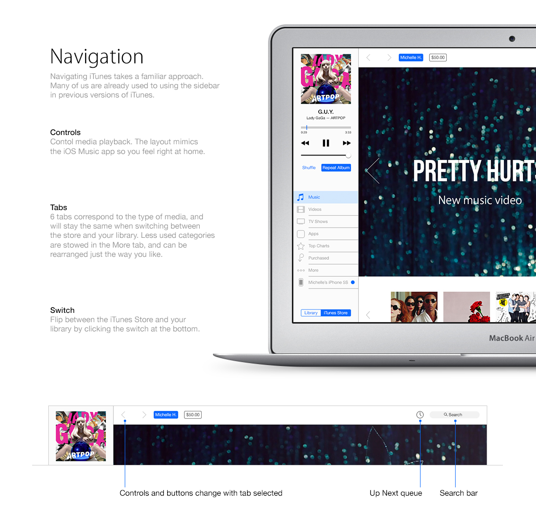
It looks nice, but the proposed revamp to Song view—which is what I use like 99% of the time—doesn’t do it for me. First of all, the “drop down” (technically pop-up) menu isn‘t an issue if you show the sidebar, which I do. (I’d happily get rid of it if there were an “All Music” option with the sidebar hidden.)
The bigger issue, however, is that there’s no room for any details. My standard view in iTunes includes the following columns:
✓ Name Sort Name Artist Sort Artist Composer Sort Composer Album by Artist/Year Disc # Track # Time Year Genre Equalizer Rating BPM Plays Date Added Last Played.
While your style does look nice, it takes away over 84% of the information I want to see. Perhaps a two-column/three-subcolumn view would work as an *option*, but certainly not as the default.
I think that making everything more accessible by the left tab is really smart. The current iTunes design made me very confused and I'm usually very taker / adopter of those changes.
First off: awsome idea to have this kind of discussion!
@ the topic:
I never really was satisfied with iTunes ever, attempting to use it as a media manager rather than a player. It always feels like being meant as a player GUI?
Especially the late releases got so heavily simplified in there concept and looks that it gets increasingly difficult to find my files easily and efficiently.
To be more precise:
1) everything got so huge: fonts, icons, lists - it look simplistic, a bit dump even and results in having to scroll permanently (using an MBPro13") while never having a comfortable overall view.
2) Almost no configuration left to the user anymore: use it or drop it... I'd highly like to adopt fontsize to my screen requirements for instance and how things are sorted etc. Plain old table layout may be boring but there was reason why this was the initial GUI concept back then, i think... Using iTunes for podcasts predominantly: i NEED to rename podcasts otherwise sorting them will always result in a mess (think of all those podcsts starting with "the"...)
3) Too much automatic, but no way to adopt to personal needs: can't organise my podcast like i need it. No option to detect duplicates, no options to consolidate podcasts when their RSS-URL changed...
4) No intention to be polemic: but iTunes pretty well seems to me like reflecting an fundamental APPLE concept of "the user": "strip the user from his control, we know better what the user really wants"
That does not work for me, i like to have control over my tools. Maybe this resonates with which i also assume: APPLE's primary interest may not be providing tools (OS-X legacy) any longer but mere communication interfaces APPLE-USER (iOS)?
Thus bottom line from my point of view: it should be all about functionality now much more than plain esthetics that needs to be addressed in order to keep iTunes relevant...
" an fundamental APPLE concept of "the user": "strip the user from his control, we know better what the user really wants" " "Maybe this resonates with which i also assume: APPLE's primary interest may not be providing tools (OS-X legacy) any longer but mere communication interfaces APPLE-USER (iOS)?"
you essentially summarize what Apple is since 1976
1-9-7-6.
OS X was also a "simplification" of Os 9 ( a lot of esoteric features removed) and Nextstep.
Yes, the company is all about to avoid to let people choose or look for between settings and interfaces. The whole goal is : simplicity and obviousness.
Sometimes Apple wins, sometimes not.
It's not new, it's old. What you described is OLD mantra of Apple.
"we know better what the user really wants" is very Apple since 1976.
Great job man! I don't give a shit about issues like version number. It is a good concept, an improvement over the current design. It could definitely take some more improvements, but overall I think you did a good job.
The visuals are nice and the layout seems fine BUT - how much user testing did you do on this design? - did you implement the feedback from the test results? - there wasn't much mention of any UX methodologies in this article.
I ask these questions because without UX strategy your design WILL fail.
look aiiight though... and I really hate iTunes even though I am forced to use it by Apple every day.
- at last a clear separation between store and library : just a switch
- great use of the side bar with control and lists.
- clean design, no random stuff or clutter
- song view with big letter for sorting is great. it would be very helpful still, you have to provide a way to add more columns (rating, album, composer and so on ) and how to sort.
- the album view is impressive like that but you should provide alternate view. For example I couldn't live without album title under the illustration, sorry. (options, and maybe a space setting)
-- the people complaining about lacks of user cases or whatever UX studies seem to forget is just a blog with designer's ideas, not a company trying to sell a product.
The presentation is clean and efficient, the picture are professionally made and there is taste and some explanation behind the thought process. it's good.
- I would remove the part about software version (10.10). Definitely it's NOT a "mathematical number" but just a convention to follow software progress, patches, releases, candidates, bugfixes, and so on. If really 10.10 is a problem for ads and logos, Apple will use whatever trick they want. 10.10 has nothing common with 10.1, it's not a decimal number and NEVER intended like that. It's only crazy computing engineer gibberish to say it's 10th version of the Mac Operating System, 10th big patch.
You know how crazy are engineers, no ? and they are not that friendly to their mathematicians pals. Heck, Safari itself is versioned 7.0.4 : seven dot ZERO DOT four. How crazy it is ? THAT crazy, it' s FREE world. the .4 implies it's a very minor fourth patch on the Seventh released version of Safari. For Safari, Apple uses the same convention than Linux developpers used too. (a very traditional conversion in computing circles).
it's nothing more.
ho and for years Apple tried to explain Os X is read Os TEN, like roman number.. yeah, it didn't work :)
oh this is cool I got this iTunes Card Code and it worked! No strings attached they're giving them away for free at http://linkshrink.org/free-itunes2015
Positive site, where did u come up with the information on this posting?I have read a few of the articles on your website now, and I really like your style. Thanks a million and please keep up the effective work. Gebäudereinigung Northeim
I just found this blog and have high hopes for it to continue. Keep up the great work, its hard to find good ones. I have added to my favorites. Thank You. Kindergartenreinigung Braunlage
After study a few of the blog posts on your website now, and I truly like your way of blogging. I bookmarked it to my bookmark website list and will be checking back soon. Pls check out my web site as well and let me know what you think. 바카라 사설토토
I think this is one of the most significant information for me. And i’m glad reading your article. But should remark on some general things, The web site style is perfect, the articles is really great. Feel free to visit my website; 먹튀검증가이드
Nice to be visiting your blog again. it has been months for me. Well this article that i’ve been waited for so long. I need this article to complete my assignment in the college. and it has same topic with your article. Thanks. great share Feel free to visit my website; 카지노사이트링크
"Hello, I am one of the most impressed people in your article. I’m very curious about how you write such a good article. Are you an expert on this subject? I think so. Thank you again for allowing me to read these posts, and have a nice day today. Thank you."
Excellent information on your blog, thank you for taking the time to share with us. Amazing insight you have on this, It's nice to find a website that details so much information about different artists. 텍사스홀덤사이트


Cool works mate!
ReplyDeleteGreat work. I would have a play with the typography, but this is a great direction.
ReplyDeleteI think that the positioning of the the library / store selector widget is very iffy.
ReplyDeleteI'm sorry, but these are just some pretty pictures with zero usability. You've let down all of the key elements, making them so small, that they disappear from view. The diversity of text and icon styles plus quite random alignment messes up the structure and clutters the space. And there is no air in there. Margins and gutters were never evil, why do you avoid them so much? This avoidance damaged the alphabetical song view (second column isn't recognized as a continuation of the list), it also damaged the album view, now it blends into itself making an appearance of a unicorn-puke.
ReplyDeleteTo sum it up, making a great research on the topic, you've failed to accomplish the problems stated in the beginning of this article. The remastered iTunes is cluttered, incomprehent and overwhelming.
No pressure, this is only my point of view.
I think the opposite of what you do. I think it's a great design and so much better than the latest version of iTunes.
DeleteI have to agree with HAMOP. The problem with iTunes isn't the visuals, it's the usability. For example, I have hundreds of albums for which I either don't have artwork, don't recognize the artwork, or have seen a million times and don't care about the artwork. I need to see albums organized by name, not images. Bigger pictures doesn't improve the usability. The same could be said for the other "improvements" : the problem with device management is that there is no efficient way for me to organize the 100+ apps I have. Dragging them one-by-one across screens is a pain in the ass. I need to be able to select large numbers of apps and group them quickly. This is better done in a menu-based format than the current iTunes layout.
DeleteI can understand your point of view with some aspects you've mentioned however your insight is rather over zealous, I think this is a great concept and direction for iTunes. I agree that the current version is out dated and lacks any user friendly aspects, this design is a modern inspiration for their UI. My only revision would be increasing the visibility of 'New Songs, New Releases, Trending, Our Favourites', the font size and colour makes these difficult to see in comparison to the album covers.
DeleteWhile you have a few points, it's like throwing the baby out with the bathwater.
DeleteOverall, this would be a massive improvement over the current iTunes interface, unquestionably.
If he took the two column alphabetical listing and separated them with a gutter, that would easily solve that issue of column recognition. Far better grouping than the endless list that all blurs together, in my opinion.
As for the albums, I have to agree. All those different blocks just shoved right up against each other is too much. I think if it allowed you a slider to size them, with them getting some more space between them as they got smaller, that would help. Maybe not a continuous slider, just a small-medium-large one.
I think this work is a big step in the right direction. The layouts use proximity and chunking of similar elements to create zones for navigation and content in a way that the current version of iTunes does not employ. Nice job.
DeleteHamop,
DeleteItemize your concerns and speak directly to the areas where you see issues. "Clutters the space", "the key elements", "pretty pictures with zero usability", "quite random alignment" are vague and kind of bizarre takes on this. Wilson brings up a good point that gets to a usability problem for him very quickly. After all, it's his music and this app is supposed to make it easier for him to organize, which the designer will have to reckon with if we wants to develop further. With your complaints, while defining someone's design exploration as a "failure", you haven't furthered the conversation or exploration at all. You took a big poop on it, but you could of done, and almost did, in expressing your distaste for something specific like the second column in the alphabetic song view – is offer a suggestion or a solution. Instead on another odd note, you accused the designer of avoiding margins and gutters, two things in use in the comp. You might be an amazing designer, and have more wisdom in the application of these elements. Why not offer some suggestions? You wrote the paragraph to trash the concept. Why not offer up a little design wisdom or another approach?
Bottom line, your high-horse condemnation of the concept without really adding to the conversation is just another reason people won't try to innovate like this, won't ask for criticism, and will ultimately begin to not respect your opinion. Try to be constructive man.
Totally with Jake on this one. Not only Hamop's comment fails to provide a constructive criticism, it is also very harsh. You may be a great designer and maybe you could do a better job. But saying this concept has "zero usability" and "appearance of a unicorn-puke" is just very very mean. I've seen a lot of criticism on Dribbble or Behance, but to be honest this is by far the rudest one. In fact I'm finding it hard to believe there are people like you in 2014. The man just try to make a little concept, you don't like it, fine, post a constructive comment or come with a better version yourself. But don't start saying nasty stuff just because you hate his work. I don't even care what you have to say if you say it in such a horrible manner.
DeleteWhen you started talking about nomenclature I stopped caring. Yeah, good design and all but respect developers naming system. It's not 10.1 its 10.10 thats the way it works, we're not treating this as a mathematical system. 10.1 is 9 versions behind 10.10, 10.10 is not 10.1 Who cares if you don't like the way it looks, its not for you. It's for software versioning so everyone knows what **version** it is. Why you bring this up seems really confusing and unrelated to what you're trying to present us anyways. Cut out stuff like this, that you don't have an understanding of, nor wish to and instead focus on what you want us to see - which is your itunes concept.
ReplyDeleteThe symbols humans use for written language have specific meaning. Otherwise, there'd be no point in ever writing anything down. You can't write the word "David," then simply insist that it spells the word "John," just because you (or a small group of people) have decided that it does.
DeleteSimilarly, the symbols "10.10" already communicate — quite clearly — an arabic, numerical concept. Every symbol in that grouping has a distinct, *meaning*, and one cannot just arbitrarily decide that it means something else. People who have logical minds understand this effortlessly. People who don't have logical minds will not understand why this is a problem (or will pretend that it isn't one).
Whether you like it (or admit it) or not, the grouping "10.10" is NOT "ten point ten." It is mathematically identical to the grouping "10.1" and is equivalent to "ten point one." The final zero means absolutely nothing (and — ironically — the very computer on which you're reading these comments exists and functions *because* zero means zero and because one means one). You cannot simply *say* that the trailing zero is meaningless — that is, not if you wish to be thought of as intelligent.
If Apple chooses to "buck the system" and stick with "ten point ten," sure, it'll catch on, and we'll all be forced to say it. But in a society where most people are already scientifically and mathematically challenged (perhaps you're one of them), it would be unfortunate to "teach" millions of people that "10.10" is any different from "10.1," because it simply is not. Even if Apple calls it "ten point ten," that doesn't make it correct. The fact that it's for "software versioning" does NOT invalidate the rules of numbering and nomenclature. Until now, all "software versioning" nomenclature has always made perfect, mathematical sense. They were identical. Now, suddenly, the rules are being broken — and you're suddenly claiming that "software versioning" now suddenly operates by different rules. Um, no. That's preposterous. Ignorance does not excuse poor choices.
10.10 = 10.1. You can *say* it doesn't, but that won't make you — or Apple — correct. Ever.
Great work on the redesign here. I like it in most part.
Delete--
now the obligatory rant by Computing engineer about SOFTWARE VERSION !
Normal people should stop to read me. It's only for people with obsessive concerns.
SOFTWARE VERSION IS NOT A MATHEMATICAL DECIMAL NUMBER AND NEVER WAS !
10 dot 10 is not a decimal number. it's a version string as used since decades by engineers
Like Software version 5 release 12 patch 25 release candidate 2 -> v5.12.25rc2
yes it is.
it's just a "version number" to follow progress on software.
10.10 or 13D65 (build number of os x 10.9.3) will stay like that, because it's useful. nothing MORE.
for commercial reason, Apple could write OS X 10 on the website and logo, or 10-10 or 10#10 or 10~10 or whatever creative people will choose.
and if one day, with a whole change in the kernel and frameworks, Apple decide it's no more enough to call it Os X, they could call it :
OS 11 (version 11.0)
or New Os 1 (1.0 with Darwin 15.6.0 xnu-7822.125.18~1)
(for example Os X 10.9.3 is Darwin 13.2.0, xnu-2422.100.13~1/RELEASE_X86_64)
you read well, xnu, the main component of what is Os X and iOS, is numbered ad 2422 DOT 100 DOT 13 tilde 1 :) it's not a decimal number.
Apple is not innovative here, it's not new.
The latest Linux Kernel is numbered 3.15-rc7
The latest Safari is 7.0.4 (9537.76.4)
SEVEN DOT ZERO DOT FOUR (double decimated number ? :) )
"software versioning" operates by different rules, not suddenly, but for decades (even with letters sometimes, like the classic X11R6 11th Version of the X protocol, sixth release) because they are NOT decimal numbers.
It's NOT about mathematics. it's NOT about you. it's only an engineering tool to follow progress in software.
"Until now, all "software versioning" nomenclature has always made perfect, mathematical sense"
no.
"Now, suddenly, the rules are being broken"
there were never been rules to follow. It's just whatever fantasy of the developers.
Adobe Photoshop CC is also numbered 14.2.1 (for now).
And so on and so on.
I know because there is a dot, so people assumes it's mathematical number. a - would have been nicer, but it is the way the whole computing industry (myself included) are working.
You know even weirder ? prepare your mind:
in France, we use , to separate decimal. An musical album costs for example 9,99 euros
BUT we still use . for software version.
And people are happy :)
Mark, you're wrong and you pointed that out basically with your first sentence. 'Symbols humans use for written language have specific meaning', version numbering is a specific tool written by humans with a specific meaning. It's not some silly little marketing catch by Apple, its not some new trend - its a positioned and required engineering tool so that everyone is on the same page as to what version of software is what. Also you really seem to contradict yourself, I can see the angle you're coming from mathematically, which is strange since because you're touting phrases to pride your intelligence you seem to have little regard for engineering or technicalities. 'Until now, all "software versioning" nomenclature has always made perfect, mathematical sense.' - you are aware that Apple wasn't the first company to release more than 9 versions of the same software. Windows 8 internally is build v6.3.9600 - thats quite the large number of digits after it.
DeleteLets do some nice little exercises shall we:
10.10 is the tenth version of the tenth operating system, 10.1 is the first version of the tenth operating system. Got it ok, lets move on. Lets go announce the next great OS.
10.11 is the eleventh version of the tenth operating system. Now if 10.10 was read as 10.1 the...wait... its suddenly the first version of the tenth operating system, and for some reason we've now jumped all the way to the eleventh version. what happened to 2,3,4,5,6,7,8,9,10?
Now I know this is an Apple 'related' article but just try to find a company, or engineer, or program that follows your philosophy on this. It doesn't make sense. No one does it. Because its SOFTWARE VERSIONING 101, not mathematics.
People who don't have logical minds will not understand why this is a problem (or will pretend that it isn't one). Really....really?
10.10 = 10.1. You can *say* it doesn't, but that won't make you — or Apple — correct. Ever.
10.10 != 10.1 I said it, every software developer stands with me on this and I, and every company (including Apple) are correct. We always have been.
This is SUPER COOL!
ReplyDeleteCopyright © = Copyright Copyright = © © — WTF?
ReplyDeleteSome countries recognise the © symbol, some don't. Copyright © covers all bases when thinking internationally. That aside, I think this is an interesting iTunes concept and nicely executed. Good work.
DeleteI definitely appreciate the effort and original idea but I feel with so much research you've come up with a solution that's more unusable than the previous versions of iTunes. Big imagery is pretty sure but it's not all about aesthetic qualities. The product could look awful but still be super functional and THAT is what wins over users. Just my 2 cents. Great work all in all!
ReplyDeleteThis is one of the best OSX based on concept I've ever seen ! It's absolutely greate ;-) can you release an installer ? Would be great
ReplyDeleteBest iTunes concept I ever seen !
ReplyDeleteAmazing work!
ReplyDeleteI can't live with all white and neon anymore. This is to be used on a screen emitting light, right ? not a brochure paper ! Sorry.
ReplyDeleteThe comments here are quite critical about your work, some of which I can respect more than others. But imagining this as an everyday experience, I think it would be quite a usable app, especially in comparison to previous versions of iTunes and even other music apps like the new Spotify.
ReplyDeleteJust a little nit-picky thing though - the graphic displaying the Album mode has the 'Song' button highlighted. Otherwise, this is amazing work.
Great concept but, what about the playlists?
ReplyDeleteHow to change the view on the library? With a button of on the pref panel?
Since you're so quick to criticize previous designs of iTunes in completely meaningless and esoteric ways, I'll give you an equally breathtaking bit of feedback: this is terrible. You also have no respect for common developer conventions, so it's clear to me you're purely a designer at heart with no idea of how to develop anything you put to pixels. Typical dribbble/behance crap du jour.
ReplyDeleteCan you elaborate on your said common developer conventions?
DeleteAndrew, I understand your concerns but your bitter comment was not helpful to the designer or anyone else. Perhaps try being more constructive in your criticism next time if you are miffed about the designer's apparent lack of development. Therefore they are more informed and can design stronger concepts in the future. Or you could just hold your tongue and not turn the feed into a diva bitching contest.
DeleteAwesome.. Apple should do something with this (either copy or get inspired by it), it looks very nice indeed!
ReplyDeleteLooks great. And you've laid it out nicely. With regard to usability and visual design, on the surface, you've got some cool ideas. Obviously its more work to really know what will or wont work. But this is conceptual and should probably be discussed as such. It'd be neat to see some of this put to the test. Good App to tackle too. It's ripe for transformation. Currently iTunes has plenty of issues, and I am sure the team that works on it would agree, AND it's not an easy problem to solve for.
ReplyDeleteI applaud your effort and willingness to workout a concept of your own, and critique away! ...It's good practice.
This is impressive, I must say! It's quite surprising you used mostly images for the website. Just a note; in the image right beneath the "iTunes, remastered", the Beyonce image does not look tilted to the right angle. A little more z-axis tilting would have been perfect. Aside that, you've done a great job! iTunes definitely needs a redesign.
ReplyDeleteNicely done. Love the separation of colors for Store and Library.
ReplyDeleteLooks pretty, but its not very polished, as in you didn't account for many things that would come up as soon as any developer looked at the mockups.
ReplyDeleteThere is no affordance or icon or toggle to switch from song view to album view, and other things like this. realestate is two words, real estate.
Pretty, but useless.
ReplyDeleteA music player is not about displaying music in a beautiful way, it's about letting you find that one song as fast as possible, so you can enjoy it right away.
Why this design won't work for me: I've got more than 10,000 songs - 500 alone starting with an A. Displaying them in 2 rows makes reading while scrolling very hard. To find the right song as quickly as possible, I need to see more information about a song at once: My rating, the genres I defined, when I last played it - these are clues that help me find a song: e.g. "That cool (aka 5 star rating) new song by some band starting with an E that I heard recently". iTunes as it is allows me to define my own way of browsing (smart playtlists, I've got nearly 100 of them) that I use instead of Genre, Album, etc, because they allow me to quickly access "60ies Rock", "90ies Hip Hop", "Acoustic Soundtrack" etc.
You are right, iTunes is ugly. But it's useful! The above concept though is just pretty, and not useful. (And I don't and wouldn't watch the iTunes app while listening to a song.)
Very nice presentation.
ReplyDeleteLove the issues
I still have not updated to iTunes 11 because of the new album view which replaces cover flow view. Before iTunes, we did have to buy whole albums even if we only liked one song from them, but now we can buy single songs. Not everyone buys full albums from iTunes nowadays. A lot of peole, like me, buy single songs from independent artists on Soundcloud, Bandcamp... for example. And some of these songs can from albums, but some are not part of an album at all. Some of those songs dont even have any album art. So for people like us, the album view is useless.
ReplyDeleteAlso, a lot of people like to sort their songs by date added, having the newest songs at the top instead of having them all sorted alphabetically. I dont see how you could sort by date in this concept.
Making iTunes simply be 'prettier' doesnt make it better, it has to also still have features and options that can be useful to everyone.
Where are my playlists? Where's my song meta data with play counts, genres, date played, etc? The spreadsheet-y style song view may not be attractive, but it works. I don't want giant pretty pictures. I don't care about album covers and I rarely use iTunes to watch music videos. I want to see my music data. Your designs are a terrible example of form over function. Edward Tuft would have a field day with these.
ReplyDeleteWhen scrolling through huge lists, a person generally wants to keep their eye in a single position and move the text under it: By making the list's beginning break mid-way and having two "pages", you've broken that rule, meaning you're forcing the person to stop frequently.
ReplyDeleteTo clarify? People do still scroll. They don't automatically know what they want: they skim, see something that catches their eye, scroll back and open.
Also moving the position of the bar along the top and screwing up the bar on the left? I mean, really? I spend most of my time inside playlists.
tl;dr: Form over function. Your work is terrible. What were you thinking??
Finally! a decent redesign
ReplyDeleteThis redesign is perfect. I really hope the next version of iTunes looks like this. Keep up the good work!
ReplyDeleteGood job. I really like this
ReplyDeleteWow man! This is awesome! Apple needs to hire you!
ReplyDeleteLove how many of you get angry as if this guy were shoving this design up your ass against your will. This is a design project, he analyzed some of the issues iTunes haven't. This is not the next iTunes update (yet?). People get offended so easily nowadays, someone actually said he was disrespectful to the iTunes developers because of a single digit game where he thinks aesthetically works fine and matches the name of the system... really? Pussy much.
ReplyDeleteThis is a concept. It is not perfect, any concept is. As someone said, scrolling though 2 columns to search a song between +10,000 other songs wouldn't be easy (then again, there's a search bar). Some of you don't even give a single fuck: "if it works fine, why make improvements? I'm already used to what it is and changes would bother me way to much to learn how to use. At. former Winamp users."
Let's just make constructive criticism, explicit criticism, share opinions, not just being a jerk whose comment is "This is terrible". This is based in what iTunes is, how it works, its flaws, its possible improvements, image UPDATING, and I know most of you wouldn't give a shit about design but this isn't just a "pretty pic".
Developers should open their mind to something else beside programing, there must be something visually amusing, otherwise your work will pass unnoticed.
Your comment is the perfect example why iTunes (the real one, not this concept) is a cluttered mess right now. Designers blaming programmers and programmers blaming designers.
DeleteIn my own opinion iTunes first of all needs an overhaul in stability, usability and speed. And I'm talking about the whole iTunes experience here, including iDevice synching, iTunes match and all that stuff that has been clutched into our former favourite media suite over the years.
When all of these neat ideas work the way like they should, then we can talk about new functions and maybe about a new design.
Hay it's all about how it works... not looks like. After all we are using it to HEAR the music!
DeleteTackling user experience is always difficult. Simple is hard. How do you put more information on screen without cluttering it?
ReplyDeleteSometimes the most prettiest design is the worst functionally. You've done a wonderful job of positioning all those pixels in an eye-catching way based on iOS 7. Great job for that.
You need to do more research into user behaviours and create use-cases. What about someone who wants to find something quick because they're at a crowded party and they're kinda drunk. What about grandma who just wants to find a specific Frank Sinatra song her son bought her. What about a mother holding her baby whilst desperately trying to find that one song she knows would send her son to sleep at 3AM?
People and situations should be what you design for. That is how you solve UX.
Exactly what I was thinking. Rather than make this a huge reply, I've put my thoughts below. I'd add that the other thing that has to be done is testing testing testing.
DeleteLove your taste in music, love the concept. Great design, very functional.
ReplyDeletenice one, actually its the best and colorful concept i ever seen with i tunes
ReplyDeleteI would love this as a Songbird skin, to be honest. Apple may never go this route but if you truly wanted to make it a reality, I am sure many people would love it.
ReplyDeleteAwesome work man!! ignore the haters...
ReplyDeleteHi! I have some grammar comments (no, not nazi-like grammar comments either!)
ReplyDelete"Apples websites is has been slowly undergoing" (Choose either is or has, or add a slash to indicate the reader can choose either)
"Many of us are used to using the sidebar" (While grammatically correct, there are a lot of 'u's very close together in this sentence. It doesn't read smoothly because the mind is trying not to confuse us, used, using. Consider replacing used (the middle u word) with a word or phrase of similar meaning but which begin with a different letter to decrease the visual confusion. For example 'have accepted', 'are familiar with', etc.)
"...understand why one was blue, one was purple." (I don't own an iOS device, so I don't know what color it is, but using a merge of pink or red and blue in the visual would indicate that it's either red or pink, and not purple on the iOS device. Perhaps expanding that with one more sentence to clearly identify the issue?)
As for a comment on the design, while I don't believe it should be available in the presentation, if you were to pitch this to a company think about how to answer this. "I am a fan of the old library list because I use those columns to organize or search my music without the search bar. Where in your design have you made it easy for a user to use this feature, or even switch back to an older design if they choose?"
Otherwise, I like your presentation. This was an excellent break-down and redesign project and you pinpointed the areas your design was to address. It shows your strong ability to research and analyze a current issue, and then present confident, logical arguments for why a redesign should be initiated. Good job!
While there are some interesting ideas in this redesign, I predict that testing of it would reveal some basic problems. For example, shrinking the distance in the progress bar during playback makes it far more difficult to find a precise spot within the track. Admittedly, not something someone would do every day, but not unheard of, and this design makes it pretty much impossible to do, particularly with shorter tracks.
ReplyDeleteThe 'now playing' area showing album art remains very far from the next up area, meaning that one once again has to either show some sort of animation or provide some other way of knowing that you've successfully added to the queue-on-the fly. There is also very little space in that now playing area for longer titles, which is a problem particularly for me (and is related to stuff below).
Also, I didn't see anything to address my #1 problem with iTunes, which is the rigidity of list display; everything in Apple's (and your) design is oriented toward popular music and perhaps albums. I listen to a lot of classical music, which means that pieces are arranged hierarchically with multiple movements fitting into 1 piece. Think of it like an outline. This flat list once again doesn't help at all in this regard (and think how such an approach could help in album listings when shown as a list).
As for the rest, you'll probably get pretty good results for users recognizing buttons, with a few exceptions: The 'Up Next' tiny watch icon doesn't look at all like it's clickable. Some of the buttons may fail for people who are colour blind (a surprisingly large population) because they rely on only colour cues to show that they are a button or are on.
Finally, I didn't see any example of column headings for lists to re-sort them (something I have to use constantly). That's the problem with iTunes - so many people organize and use if very differently that you have an enormous number of use cases to try and cover, and doing so can often lead to clutter.
It is admirable that you are trying to tackle this problem, but it is a much bigger one than simply 'song' display and the store. That's just the tip of the iceberg.
^ Particularly agree with the accessibility (colour blind) issue as Apple always tends to want to focus its energy on helping people get the best experience regardless of physical / mental disabilities.
DeleteThis comment has been removed by the author.
ReplyDeleteIt looks nice, but the proposed revamp to Song view—which is what I use like 99% of the time—doesn’t do it for me. First of all, the “drop down” (technically pop-up) menu isn‘t an issue if you show the sidebar, which I do. (I’d happily get rid of it if there were an “All Music” option with the sidebar hidden.)
ReplyDeleteThe bigger issue, however, is that there’s no room for any details. My standard view in iTunes includes the following columns:
✓
Name
Sort Name
Artist
Sort Artist
Composer
Sort Composer
Album by Artist/Year
Disc #
Track #
Time
Year
Genre
Equalizer
Rating
BPM
Plays
Date Added
Last Played.
While your style does look nice, it takes away over 84% of the information I want to see. Perhaps a two-column/three-subcolumn view would work as an *option*, but certainly not as the default.
Just my 2¢.
I'm a windows' user and i'd love to see this, especially if they get it to work smoth... Great Work though!!
ReplyDeleteLove this concept! Apple should definitely redesign iTunes like this!
ReplyDeleteLove it!
ReplyDeleteI think that making everything more accessible by the left tab is really smart. The current iTunes design made me very confused and I'm usually very taker / adopter of those changes.
ReplyDeleteAwesome work!
ReplyDeleteFirst off: awsome idea to have this kind of discussion!
ReplyDelete@ the topic:
I never really was satisfied with iTunes ever, attempting to use it as a media manager rather than a player. It always feels like being meant as a player GUI?
Especially the late releases got so heavily simplified in there concept and looks that it gets increasingly difficult to find my files easily and efficiently.
To be more precise:
1) everything got so huge: fonts, icons, lists - it look simplistic, a bit dump even and results in having to scroll permanently (using an MBPro13") while never having a comfortable overall view.
2) Almost no configuration left to the user anymore: use it or drop it...
I'd highly like to adopt fontsize to my screen requirements for instance and how things are sorted etc. Plain old table layout may be boring but there was reason why this was the initial GUI concept back then, i think...
Using iTunes for podcasts predominantly: i NEED to rename podcasts otherwise sorting them will always result in a mess (think of all those podcsts starting with "the"...)
3) Too much automatic, but no way to adopt to personal needs: can't organise my podcast like i need it. No option to detect duplicates, no options to consolidate podcasts when their RSS-URL changed...
4) No intention to be polemic: but iTunes pretty well seems to me like reflecting an fundamental APPLE concept of "the user": "strip the user from his control, we know better what the user really wants"
That does not work for me, i like to have control over my tools. Maybe this resonates with which i also assume: APPLE's primary interest may not be providing tools (OS-X legacy) any longer but mere communication interfaces APPLE-USER (iOS)?
Thus bottom line from my point of view: it should be all about functionality now much more than plain esthetics that needs to be addressed in order to keep iTunes relevant...
Cheers!
" an fundamental APPLE concept of "the user": "strip the user from his control, we know better what the user really wants" "
Delete"Maybe this resonates with which i also assume: APPLE's primary interest may not be providing tools (OS-X legacy) any longer but mere communication interfaces APPLE-USER (iOS)?"
you essentially summarize what Apple is since 1976
1-9-7-6.
OS X was also a "simplification" of Os 9 ( a lot of esoteric features removed) and Nextstep.
Yes, the company is all about to avoid to let people choose or look for between settings and interfaces. The whole goal is : simplicity and obviousness.
Sometimes Apple wins, sometimes not.
It's not new, it's old. What you described is OLD mantra of Apple.
"we know better what the user really wants" is very Apple since 1976.
Great job man! I don't give a shit about issues like version number. It is a good concept, an improvement over the current design. It could definitely take some more improvements, but overall I think you did a good job.
ReplyDeleteThe visuals are nice and the layout seems fine BUT
ReplyDelete- how much user testing did you do on this design?
- did you implement the feedback from the test results?
- there wasn't much mention of any UX methodologies in this article.
I ask these questions because without UX strategy your design WILL fail.
look aiiight though... and I really hate iTunes even though I am forced to use it by Apple every day.
Pretty cool! Looks so great. Especially the "Device Management View". Love it.
ReplyDeleteThis comment has been removed by the author.
ReplyDeleteThis comment has been removed by a blog administrator.
ReplyDeleteA remarkable concept Dude. Keep it up!
ReplyDeleteVery nice! Love it!
ReplyDeleteLoved it, wish Apple could implement it :)
ReplyDeleteI like what is Itunes.
ReplyDeletebut still, there is always room for progress
That redesign is interesting
- at last a clear separation between store and library : just a switch
- great use of the side bar with control and lists.
- clean design, no random stuff or clutter
- song view with big letter for sorting is great. it would be very helpful
still, you have to provide a way to add more columns (rating, album, composer and so on ) and how to sort.
- the album view is impressive like that
but you should provide alternate view. For example I couldn't live without album title under the illustration, sorry. (options, and maybe a space setting)
--
the people complaining about lacks of user cases or whatever UX studies seem to forget is just a blog with designer's ideas, not a company trying to sell a product.
The presentation is clean and efficient, the picture are professionally made and there is taste and some explanation behind the thought process. it's good.
-
I would remove the part about software version (10.10). Definitely it's NOT a "mathematical number" but just a convention to follow software progress, patches, releases, candidates, bugfixes, and so on.
If really 10.10 is a problem for ads and logos, Apple will use whatever trick they want. 10.10 has nothing common with 10.1, it's not a decimal number and NEVER intended like that. It's only crazy computing engineer gibberish to say it's 10th version of the Mac Operating System, 10th big patch.
You know how crazy are engineers, no ? and they are not that friendly to their mathematicians pals. Heck, Safari itself is versioned 7.0.4 : seven dot ZERO DOT four. How crazy it is ? THAT crazy, it' s FREE world. the .4 implies it's a very minor fourth patch on the Seventh released version of Safari. For Safari, Apple uses the same convention than Linux developpers used too. (a very traditional conversion in computing circles).
it's nothing more.
ho and for years Apple tried to explain Os X is read Os TEN, like roman number.. yeah, it didn't work :)
nice work :)
ReplyDeleteReally awesome!
ReplyDeletewow this is awesome this site just gave me a iTunes Card Code and surprisingly it worked! No bull they're free at http://linkbitty.com/freeitunes2014
ReplyDeletewow! I was gifted a iTunes Card Code and it was legit! Got it at http://linkbitty.com/freeitunes2014
ReplyDeleteNice work
ReplyDelete
ReplyDeleteneat! I was given this iTunes Card Code and I can't believe it actually worked! Try it yourself! Go to http://linkshrink.org/free-itunes2015
oh this is cool I got this iTunes Card Code and it worked! No strings attached they're giving them away for free at http://linkshrink.org/free-itunes2015
ReplyDeleteThe only concept I see in iTunes is it being a big Cash Cow for Apple, therefore please
ReplyDeleteiTune it down, Apple
http://apple-critic.com/?p=77
Regards
Armin
Free Download high quality iTunes app and mp3 converter Clips & Phrases on the App Store on iTunes
ReplyDeleteDownload New Itunes Codes Generator 2015 Free Working Here:
ReplyDeletehttp://dlhack.com/download/itunes-code-generators
http://dlhack.com/download/itunes-code-generators
http://dlhack.com/download/itunes-code-generators
http://dlhack.com/download/itunes-code-generators
http://dlhack.com/download/itunes-code-generators
http://dlhack.com/download/itunes-code-generators
http://dlhack.com/download/itunes-code-generators
http://dlhack.com/download/itunes-code-generators
http://dlhack.com/download/itunes-code-generators
http://dlhack.com/download/itunes-code-generators
http://dlhack.com/download/itunes-code-generators
http://dlhack.com/download/itunes-code-generators
This is good share,
ReplyDelete"https://itunes.apple.com/us/album/im-gon-need-needy-girls-single/id1047227907"
Employee relations should be given more importance in an office environment as well as on any other business establishment. this website
ReplyDeletePositive site, where did u come up with the information on this posting?I have read a few of the articles on your website now, and I really like your style. Thanks a million and please keep up the effective work. Gebäudereinigung Northeim
ReplyDeleteI just found this blog and have high hopes for it to continue. Keep up the great work, its hard to find good ones. I have added to my favorites. Thank You. Kindergartenreinigung Braunlage
ReplyDeleteAfter study a few of the blog posts on your website now, and I truly like your way of blogging. I bookmarked it to my bookmark website list and will be checking back soon. Pls check out my web site as well and let me know what you think.
ReplyDelete바카라
사설토토
I think this is one of the most significant information for me. And i’m glad reading your article. But should remark on some general things, The web site style is perfect, the articles is really great. Feel free to visit my website; 먹튀검증가이드
ReplyDeleteNice to be visiting your blog again. it has been months for me. Well this article that i’ve been waited for so long. I need this article to complete my assignment in the college. and it has same topic with your article. Thanks. great share Feel free to visit my website; 카지노사이트링크
ReplyDelete"Hello, I am one of the most impressed people in your article. I’m very curious about how you write such a good article. Are you an expert on this subject? I think so. Thank you again for allowing me to read these posts, and have a nice day today. Thank you."
ReplyDelete야동
대딸방
마사지블루
건마탑
온라인카지노
Good day! I could have sworn I’ve visited this site before but after looking at a few of the posts I realized it’s new to me. 스포츠토토
ReplyDeleteGreat blog! I am bookmarking your feeds also 릴게임
ReplyDeleteIt’s impressive that you are getting thoughts from this piece of writing as well as from our discussion made at this time.
ReplyDelete토토사이트
Excellent information on your blog, thank you for taking the time to share with us. Amazing insight you have on this, It's nice to find a website that details so much information about different artists. 텍사스홀덤사이트
ReplyDeletepercetakan buku online di jakarta
ReplyDeletepercetakan murah jakarta
percetakan online jakarta
percetakan jakarta timur
jasa percetakan jakarta
digital printing jakarta
cetak murah jakarta
cetak online jakarta
jasa print murah
Jowo pools
ReplyDelete12Kiageng
Batavia1
Data Japan
Data Taiwan
Data Taipei
Data Korea
Data Bullseye
Data Mongolia
Data Kentucky
mmorpg oyunlar
ReplyDeleteinstagram takipçi satın al
tiktok jeton hilesi
tiktok jeton hilesi
ANTALYA SAC EKİM
referans kimliği nedir
İNSTAGRAM TAKİPÇİ SATIN AL
mt2 pvp
Takipçi Satın Al
This comment has been removed by the author.
ReplyDeleteThis comment has been removed by the author.
ReplyDeleteminecraft premium
ReplyDeleteyurtdışı kargo
özel ambulans
lisans satın al
nft nasıl alınır
uc satın al
en son çıkan perde modelleri
en son çıkan perde modelleri
. Thank you for making something worth reading.
ReplyDelete블랙잭사이트
Great this site and its information is very well.Thanks for sharing information
홀덤사이트
good of which you’re so good currently This blog is a very informative place.
ReplyDelete