

I was commissioned by Start Up Weekend to design the t-shirts that circulated at the Mega Start Up Weekend, September 2011 event. Read on to see the makings of the shirt.

I wanted to talk a little bit about how this design came about, and what my methodology was throughout this whole process.
Step 1 - Defining limits
I take into consideration what medium I'm using. In this case, paint on a shirt. Most shirt screeners aren't meant to print fine details, like distressing or fine gradients. Also, because of the printing limitations, one color of ink would be allowed.Step 2 - Ideation and Creation
When I read the brief, I threw around a few ideas for a couple days. I knew I wanted to incoperate everything into the design, but still couldn't piece together something I was satisfied with.I sketched out a few ideas, but ended up with nothing. A few days later, I was reading through a some tech news, and I came across an article on Windows Phone 7's Mango update. And then, it hit me. THIS was it.Step 3 - Feedback and Revision
I worked closely with SUW for roughly 2 weeks, shooting back emails of revisions and updates to see what worked. A whole lot of changes, adjustments, and touch ups were made, I hope Gmail didn't mind the traffic!Here is the original:

I initially set out to design SUW's August event t-shirt. Above was the original design I presented to them. In the end, my design was incorporated into their September event. I re-worked the charms to fit around the new title: Mega Start Up Weekend."
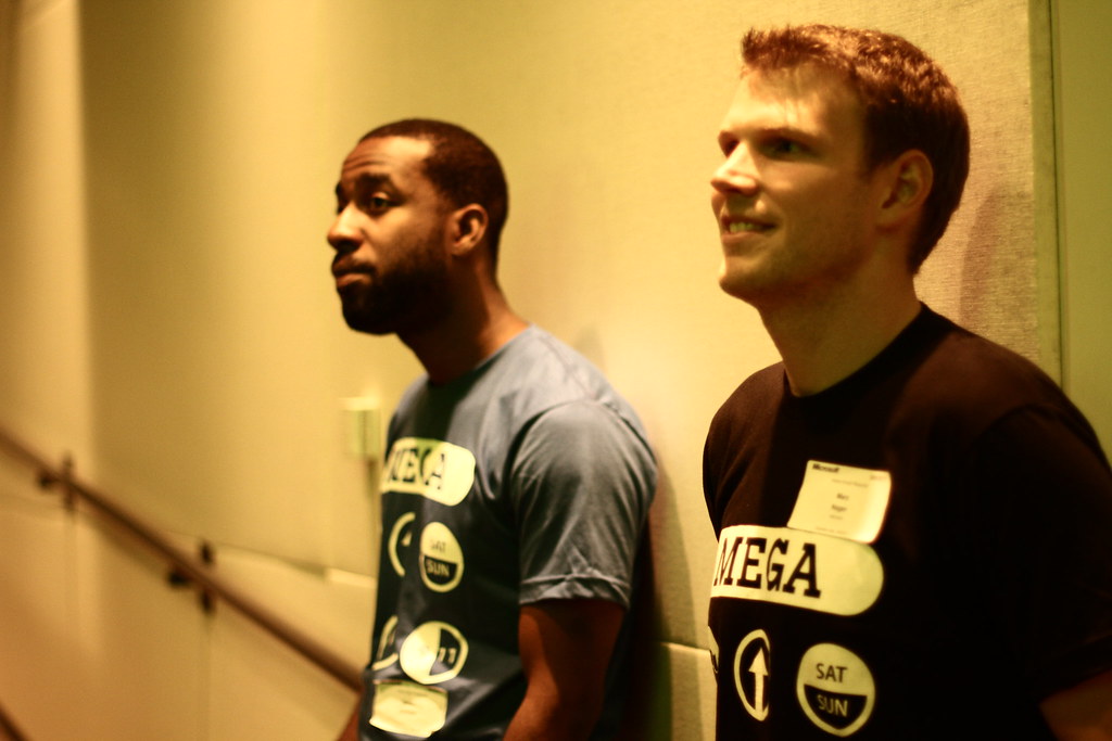
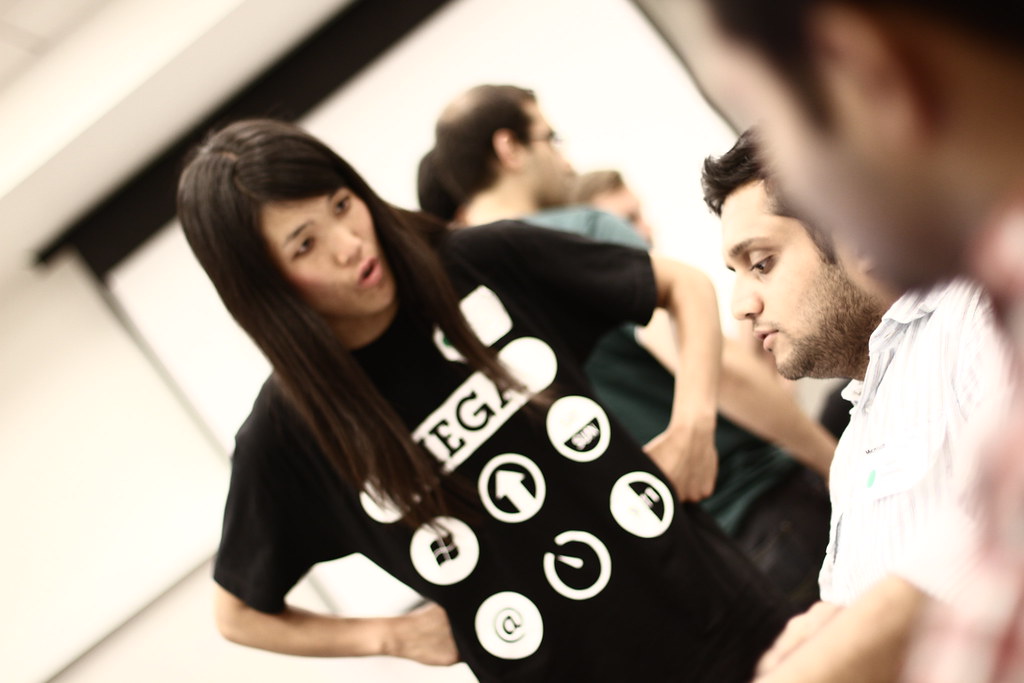
You can view all the photos from the event here.If you're still a bit confused as to what they mean, the title of the event was "Mega Start Up Weekend At Demo, September 2011". I took each word and designed a charm for them. A larger "Mega button", very reminiscent of the buttons used by PayPal. A Windows logo for "Start". An upwards arrow for "Up" (which also happened to be the logo of one of the sponsors). Saturday and Sunday abbreviated for "Weekend". An @ symbol, for at. A clock for Demo (which is also the logo of another sponsor). And finally, 9 and 11 for September 2011.
Whew! Quite a mouthful! I'm super stoked about how it came out, and as you can see, the shirts are nothing short of amazing. I absolutely love white on color, especially on t-shirts (you don't see white ink to often, and it makes a bold statement!)
Step 4 - Wait, there's more?!
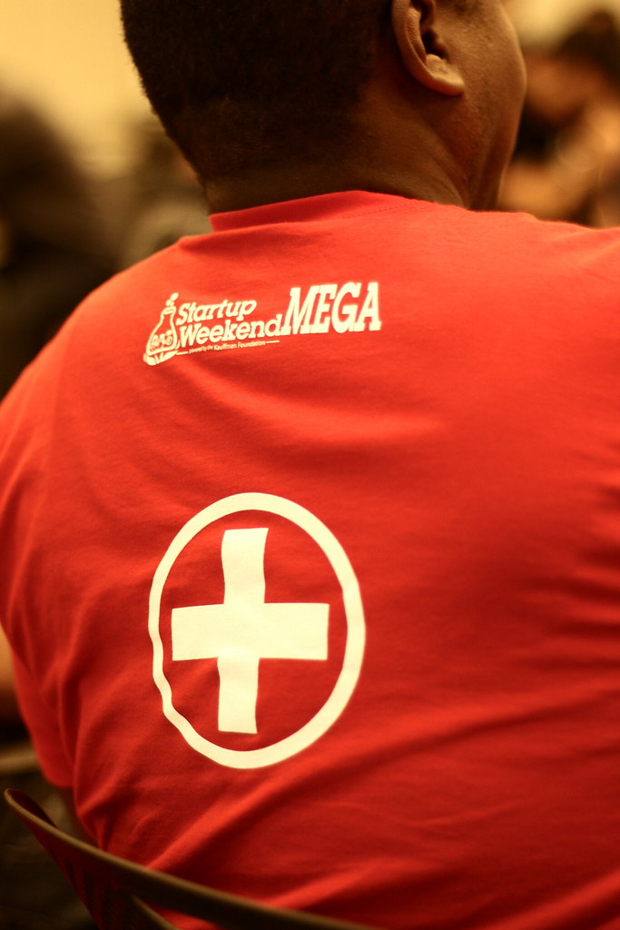
SUW also said the event would feature three categories: Health, Gaming and education. So, they wanted three more charms to represent them, and be placed on the back. The Health and Education are pretty self explanatory, but the one I'm most attached to is the gaming charm. I had originally decided to use the usual Play Station controller, but they suggested going old school, NES old-school. I love the way it came out, and how it plays homage to such an iconic part of history. Each charm was featured on a different colored shirt, and combined on a black colored shirt.I'm honored to have been a part of Start Up Weekend's event, and even more excited that over 350 people sported my design. I've learned a whole lot from doing this project and hope to use this knowledge in future projects. Thank you, Start Up Weekend.
No comments:
Post a Comment